|
|
Post by Dante on Jun 25, 2015 12:14:31 GMT -5
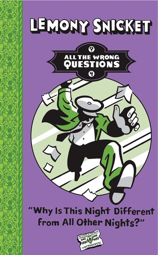
It's that time again - the annual event where we can finally cash in our guesses as to what U.K. publisher Egmont will do with the cover of the latest volume in ATWQ, now for the final time. Here it is, folks - the end of the line, straight from Amazon... Bonus points to anyone who can tell me the exact way in which each of Egmont's ATWQ covers has done something different from every other volume. |
|
|
|
Post by Poe's Coats Host Toast on Jun 25, 2015 12:38:52 GMT -5
This one breaks the frame of the circle for the first time, having Lemony's foot and some flying paper "pop out." Definitely makes for a more energetic cover.
And "The Thistle of the Valley" seems to be quite the poetic name for a train. It also reminds me a bit of Lily of the Valley (which has been an important plot device in Breaking Bad once).
|
|
|
|
Post by Isadora Is a Door on Jun 25, 2015 12:42:02 GMT -5
well, okay, thats actually the cover i like most so far
|
|
|
|
Post by Christmas Chief on Jun 25, 2015 17:29:24 GMT -5
Well, if we look at the previous three (from this thread) ... 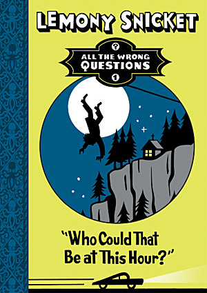 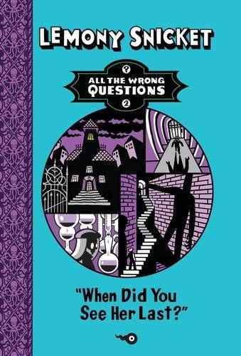 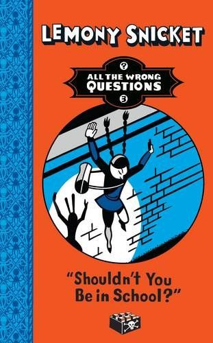 ... We can see the center images vary in style (single-paneled vs. multi-paneled, pop out vs. confined). Additionally, while individually the spine/background color combinations are visually appealing, I'm not sure I like them taken together - I keep trying and failing to make a pattern of it. (Or perhaps it's simply that this volume uses the same color pairing as Little Brown & Co.'s ?2). Overall, though, I agree: this is the best Egmont cover yet. |
|
|
|
Post by A comet crashing into Earth on Jun 25, 2015 17:51:47 GMT -5
I think it's interesting that we now know that the Bombinating Beasts found in the previous books' interiors haven't spread to the spine, as that would almost certainly be visible on the part that overlaps with the front cover.
|
|
|
|
Post by bandit on Jun 25, 2015 18:03:57 GMT -5
However, in the first Egmont cover all the octopuses have neutral expressions; every other cover has a mixture of angry and worried octopuses.
|
|
|
|
Post by Dante on Jun 26, 2015 3:04:04 GMT -5
In real life, the arrangement of octopi on the spines is identical on the hardcovers of ?2, ?3, and the newly-presented ?4, but the orientation is different on the ?2 paperback. I'm also disappointed that the spread of Bombinating Beasts hasn't hit the spines, though I suppose there might still be one hidden on the side or back. Here's what I was looking for in terms of how each cover differs from the rest: ?1 has an original secondary colour; ?2 has an original secondary colour and a collage-style central image; ?3 swaps the LB primary and secondary colours; and ?4 has the LB primary and secondary colours in the correct arrangement. Thus not one cover in the whole series is consistent with the rest. Incidentally, Egmont's Australian subsidiary, which publishes the series in that country, sometimes has covers that are slightly different again and which may in fact be early drafts produced by Egmont's cover designer. I'm really pretty steamed at how the covers of the series have been handled by Egmont; LB too, but the fact that Egmont's put out such a visibly inconsistent series - you don't have to be a fan to recognise that ?2's cover is totally different in style and ?3 is inconsistent with the interior colours - is inexcusable. After all, it's not like they can't turn out excellent covers for other books - if they only rip off Seth's work while refusing to publish the book they borrowed from. |
|
|
|
Post by gliquey on Jun 26, 2015 3:37:40 GMT -5
Incidentally, Egmont's Australian subsidiary, which publishes the series in that country, sometimes has covers that are slightly different again and which may in fact be early drafts produced by Egmont's cover designer. Thanks for that link, Dante - I like that cover of ?3 better than both the UK and US covers. I think it combines the best aspects of the two. |
|
|
|
Post by Cafe SalMONAlla on Jun 26, 2015 4:48:28 GMT -5
I find that the title font looks ugly when it writes something as long as this. The woes of a nine-word title. And what's with the lighting-bolt-like border line? I never noticed it on the other uk covers until SA posted them here. Granted, I've never seen them in person.
|
|
|
|
Post by Dante on Jun 26, 2015 6:11:05 GMT -5
I considered once that it might be intended to be coiled rope, but in fact I think it's just generic. Heaven knows what possessed them to leave the border literally blank on the Australian covers; it looks dreadful.
|
|
|
|
Post by Cafe SalMONAlla on Jun 26, 2015 6:45:06 GMT -5
Yes, the blank border makes it look unfinished.
|
|
|
|
Post by cwm on Jul 6, 2015 15:45:12 GMT -5
I've generally not liked the UK covers for ATWQ and I'm afraid I think this is the worst - I think the section of the US cover really loses something in translation here, but the US covers' multiple elements really seem to have more of the ethos of the books around them.
|
|
|
|
Post by gliquey on Jul 6, 2015 16:49:43 GMT -5
I've generally not liked the UK covers for ATWQ and I'm afraid I think this is the worst - I think the section of the US cover really loses something in translation here, but the US covers' multiple elements really seem to have more of the ethos of the books around them. This is my least favourite UK cover too, although I can't say I don't like the other UK covers. I think with the US covers, I don't really know what I'm supposed to be focusing on - it's just a bit of a mess (albeit still quite a nice mess) - while the UK covers have a center image (or, with ?2, center images) the eye is immediately drawn too. |
|
|
|
Post by Dante on Jul 7, 2015 3:00:18 GMT -5
To be honest, I don't think the covers have been handled very well on either side of the Atlantic. It's a dreadful shame.
|
|