|
|
Post by Christmas Chief on Jun 8, 2012 14:12:33 GMT -5
|
|
|
|
Post by Kensicle on Jun 8, 2012 19:56:11 GMT -5
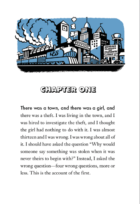
I like the look of the illustration. What does it say on the side of the train? LES or L&S(Lemony and Seth)?
Note also the time on the clock face; it's the same time as the clock shown on the cover, although this illustration's in day and the cover illustration's at night. I wonder if there is any significance in that.
|
|
|
|
Post by B. on Jun 9, 2012 2:55:29 GMT -5
I don't think I like the style. It's very cartoony, but I suppose it'll grow on me.
|
|
|
|
Post by Christmas Chief on Jun 9, 2012 6:44:28 GMT -5
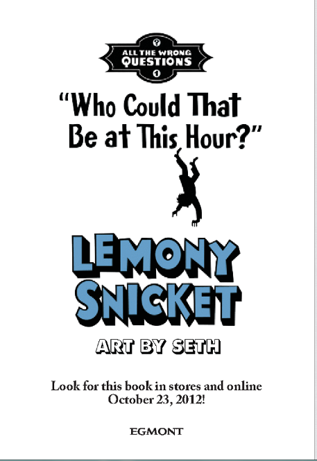
The style matches the content at least, I think. Note the illustration is in color, which helps visualize the page texture on which this book will likely be printed. Interesting observation about the clock, too. I read the train as "L&S" as well, and I don't think it would be so inappropriate to use the initials of Lemony and Seth in these early parts of the book. "LS" was something of a joke in ASOUE, because, like "JS", it stood as something different for multiple parties.
On another note, there are fifteen pages in this chapter. If we take Amazon's estimation of 272 pages and divide it by fifteen pages a chapter, that gives us a total of eighteen chapters with about 160 words per page. The print size and spacing is actually very similar, if not identical, to that used in ASOUE.
Edit: Also, the price of the book has gone up $5 on Amazon, and I expect other sellers to soon follow suit. So if anyone had doubts about pre-ordering ...
|
|
|
|
Post by Dante on Jun 9, 2012 13:51:16 GMT -5
You know, the writing style actually reminds me of "The Mysterious Benedict Society". And the plot has some similarities, (ex. Children embarking on secret missions). Even though ATWQ is written in 1st person, it has that omniscient feel. asdfghjkl, can't wait!  Ever since we found out what the series would be about, I've been mentally comparing it to TMBS, and a little bit to Pseudonymous Bosch's work. I think it'll be better than those, and certainly a lot more serious than Bosch, but I think they're interesting analogies, as in reading those I initially thought they were a lot like Snicket. And I wonder if that's a case of multiple authors gravitating towards a particular form or idea that's meaningful to the youthful audience of today. Great job catching the Guardian version of the chapter, Sherry Ann; I noticed that when I got home. The chapter illustration gives me a lot more faith in Seth's style, actually, as while it is a bit cartoony, it also has this sort of noir-ish art deco look, this interplay of light and shadow in a retro-archaic setting, that I think is characteristic of Snicket's style and setting. It really works for me - and I agree that L&S is either a nod to Lemony & Seth, or a reference forward to later, when we learn the actual name of the train (but I'm sure it'll be the former). Kinda disappointing to see that the internal formatting, which is to say stuff like the choice of font for the chapter heading, remains somewhat cartoony - like the cover text, I feel that's inappropriate, a product more of someone who thinks they know what Snicket's about without having read the text. ASoUE took itself completely seriously in all respects, and I feel ATWQ's presentation isn't quite that careful. But I am completely confident in the text, and considerably confident in the illustrations. |
|
|
|
Post by B. on Jun 9, 2012 14:44:30 GMT -5
Yes, the opening page looked a bit disappointing, but we are still seeing the blue theme, which is appropriate if it's set in a town named "Stain'd by the Sea."
|
|
|
|
Post by cwm on Jun 10, 2012 10:22:22 GMT -5
I've got to say, that Guardian preview looks a bit more cartoony and childish (loathe as I am to use that word) than I was expecting - if I'd go by that, it seems to be aimed at a younger age group than ASOUE. Still, I do get a bit of a Snickety vibe from the whole thing for the reasons Dante said, and there's no disconnect between illustrations and text (looking at you, Artemis Fowl redesign).
I liked the chapter itself although can't really draw too much from it. Difficult to make any conclusions at this stage.
|
|
|
|
Post by Dante on Jun 10, 2012 10:38:32 GMT -5
I've got to say, that Guardian preview looks a bit more cartoony and childish (loathe as I am to use that word) than I was expecting - if I'd go by that, it seems to be aimed at a younger age group than ASOUE. That really is primarily the effect of the font choices, and to a certain extent Seth's more stylised rather than realistic illustrations. It doesn't reflect on the text at all, but rather on the judgement of the design team at Handler's new publishers. I do imagine that HarperCollins would have handled the packaging differently. |
|
|
|
Post by B. on Jun 10, 2012 13:09:52 GMT -5
Yes, the artwork and the font screams "aimed at children 8-12" to me, but the text is very very different, and I actually really like the writing style.
|
|
|
|
Post by Dante on Jun 10, 2012 13:17:43 GMT -5
With any luck, professional reviews will reflect our opinions on this matter. The artwork is really growing on me, and I think the illustration we have for Chapter One is great and the best one yet. But I've made my feelings clear about the font before, certainly.
|
|
|
|
Post by B. on Jun 10, 2012 14:05:58 GMT -5
I agree on the font. I do like the cover though, but not so much the font, although the cover took quite a bit of time to grow on me, and I suppose the illustrations will be the same.
As talented as Brett Helquist is, I don't think he could've illustrated this series. Yes, it is a prequel but it is a different story entirely and needs a different "look."
|
|
|
|
Post by Christmas Chief on Jun 10, 2012 14:28:05 GMT -5
The font, by the way, is Futura for headings and it looks like Times New Roman (same as ASOUE) for the body. I rather like the gloomy city feel Seth's work offers, and I don't feel we can fairly compare it to Helquist. This is a different series with a different mood and considerably darker style.
|
|
|
|
Post by Poe's Coats Host Toast on Jun 11, 2012 11:58:54 GMT -5
I really like the choice of Futura for the "Chapter"s; but I don't think the first page is going to be the actual front page. Note the "Look for this book in stores and online.." and how all the graphic elements are taken from the cover. I think it's just a quick promo page made by The Guardian so that people know what they're reading. And while I'm not a fan of this first page's design, I actually really like the illustration above "Chapter 1." It's pretty classy in its simplicity.
|
|
|
|
Post by Dante on Jun 11, 2012 12:26:53 GMT -5
Made by Egmont, rather - but, bar the promotional tagline, I find it quite probable that that or something quite similar will be the title page, as it resembles their usual ones.
|
|
|
|
Post by Christmas Chief on Jun 11, 2012 13:13:48 GMT -5
It has all the necessary information for a title page, in any case. (The "Chapter One" font you're referring to, Kensicle Terry Craig, is more specifically Futura shadow extra bold, whereas the first line of the chapter is a more simplistic version of the same family.)
|
|