|
|
Post by Zaid on Jul 15, 2007 11:14:51 GMT -5
I'm posting this on behalf of Tragedy. Basically, he added a new code which pushes the "Hey X, you have x messages" down under the banner and centers it, therefore centering the banner. Please vote and tell us what you think  |
|
|
|
Post by Gigi on Jul 15, 2007 11:19:50 GMT -5
I don't like it, but maybe that's just because I'm used to it the other way.
It not only moved the PM message under the banner, it makes the text smaller. I definitely don't like that.
|
|
|
|
Post by Dear Dairy on Jul 15, 2007 11:23:04 GMT -5
I think it has a more balanced look overall, although I usually prefer asymmetrical balance. It would look better with the banner stretched all the way across the top. Even better would be the old banner-left placement, with a bolder message center next to it for balance - maybe?
|
|
|
|
Post by Zaid on Jul 15, 2007 11:30:00 GMT -5
I'm working for a bigger banner, so that is OK. And the the board can be resized too, if needed.
|
|
|
|
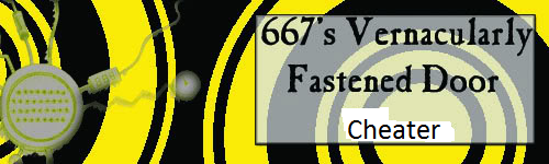
Post by Zaid on Jul 15, 2007 12:18:03 GMT -5
Well, new banner ...
|
|
|
|
Post by s on Jul 15, 2007 12:59:38 GMT -5
I like it a lot.
|
|
|
|
Post by Zaid on Jul 15, 2007 13:00:36 GMT -5
The banner or the code?
|
|
|
|
Post by s on Jul 15, 2007 13:04:00 GMT -5
Uh, both?
|
|
|
|
Post by Zaid on Jul 15, 2007 13:05:46 GMT -5
LOL thanks.
|
|
|
|
Post by Amanda on Jul 15, 2007 15:23:44 GMT -5
Looks fantastic. I love it.
|
|
|
|
Post by Gigi on Jul 15, 2007 15:45:07 GMT -5
I don't like the yellow. Too bright and it clashes with our orange.
|
|
|
|
Post by Zaid on Jul 15, 2007 15:48:41 GMT -5
I know. Unfortunately, I took the orange color, and did a black-orange gradient. That's how it came out. Eugh.
|
|
|
|
Post by s on Jul 15, 2007 17:08:21 GMT -5
I thought it was orange. I didn't really notice a difference.
|
|
|
|
Post by Dear Dairy on Jul 15, 2007 18:06:20 GMT -5
I rather like the yellow.
I do agree with Gigi that the text for the PM line needs to be bigger.
|
|
|
|
Post by Snicket on Jul 15, 2007 18:39:12 GMT -5
I like it, but I don't like the fact that the PM message text is smaller.
As for the color, I think that it is fine. In theater design, it is commonly thought that if something clashes with another color, then it is jarring and attention grabbing (in a good way). However, if that yellow color in the banner is overused, then the forum would look boring. I may be wrong, but I think that it is okay when coming from a set design point-of-view.
|
|