Antenora
Detriment Deleter  Fiendish Philologist
Put down that harpoon gun, in the name of these wonderful birds!
Fiendish Philologist
Put down that harpoon gun, in the name of these wonderful birds!
Posts: 15,891 
Likes: 113
|
Post by Antenora on Mar 28, 2012 10:30:32 GMT -5
I think the cover's design is flawed, too. The nameplate is nice, but it clashes with the author/title text, which clashes with everything else. I actually would have preferred if they'd just kept the teaser cover for the final version.
Oh, and I like Dante's idea that each book will be a different color. Once we've had blue, red, and perhaps yellow or green, the final cover could be monochrome.
But now that we know this cover is the official one, it raises another question: what, if anything, does this cover reveal to us about the book's plot? It appears that ink is fairly important, though we could have inferred that already. The only image that's really novel is the lighthouse.
|
|
|
|
Post by Hermes on Mar 28, 2012 10:52:53 GMT -5
Edit: And I've got to say I agree with Sora's concerns. The cover art as it stands does look a little more kiddy than ASoUE's. It's got class, but with all the edges rounded off. And while I don't think any of us are expecting Handler to be catering to the now-grown-up original audience, for him to be writing for an audience younger than the original series is not something we're prepared for. Although I have thought that the Lemony of ATWQ might be aged around ten or eleven, for various reasons. But as Sora also says, 8-12 was the original demographic for ASOUE: it is, unequivocally, a children's series, though with depths that also enable adults to appreciate it (as lots of children's books, from Alice in Wonderland to Harry Potter, have). The fact that even our youngest members are teenagers may lead to our forgetting this sometimes. So I don't think we need see the new series as aimed any younger that ASOUE. On another note, didn't you once write a fanfic about a lighthouse? |
|
|
|
Post by B. on Mar 28, 2012 10:54:52 GMT -5
The lighthouse in the sea is interesting- so in keeping with the blue colour scheme will this be a sea themed novel? Actually it would be interesting if all the books were themed around elements: water, earth, wind and finally fire. It's unlikely though.
There's the statue, and the ink from the Ellington Feint promotion and Lemony falling off a cliff side it looks like. The image of the man is quite striking, in fact the way he's walking though the building with hands out stretched suggests to me that it's some kind of child snatching- which fits in with the "taking" which is traditional in VFD. There's also the long black car, which is from the little snicket lad song, the vehicle which took him from his home.
Edit: But I do agree with Antenora, that the name plate and the title and author panel do clash horribly.
|
|
|
|
Post by jman on Mar 28, 2012 11:18:50 GMT -5
I, for one, love the cover! For any other Canadians out there, it reminds me alot of "The Vinyl Cafe" covers.
|
|
|
|
Post by Christmas Chief on Mar 28, 2012 14:28:25 GMT -5
It's the real cover? And it was leaked early, from someone within Hachette? Pfft. No, I'm not a fan of that font at all. The graphics are tolerable, but those cartoonish block letters aren't doing Lemony's name any favors. Then there's the diagonal line, which is going to bother me now that I know it's there; I'd hoped it would be removed after the teaser. To be fair, I do like the intriguing graphics, as well as the consistent color scheme. On a similar note, the color change suggested is actually a common marketing scheme for serialized books. All the covers have the same layout, but adjustment of color or illustration so when people walk into a book store they think, "Oh, I've seen these books before. But the copy I have is red, and this one is green - it must be the sequel. I'll buy it." It also gives a series an external consistency. I think we'll be getting more information between now and October. Why start something in February and quit in March, when the book isn't to be released for another six months? The website opening I'm less hopeful for. "Drop Everything" never actually told us they'd be starting up the website, but then why drop everything for a cover we've already seen most of? Edit: On another note, didn't you [Dante] once write a fanfic about a lighthouse? Was it Lavender Lighthouse, in Realtors in a Cave? I think that particular lighthouse was also mentioned in ASOUE. |
|
|
|
Post by Poe's Coats Host Toast on Mar 28, 2012 19:42:54 GMT -5
I certainly do miss Helquist's unique and carefully detailed artwork, but I'm not going to dislike this new style just because it's different. This artwork has definitely something nostalgic and retro going on which really fits into the Snicket world. I can't wait to see what the illustrations inside the book will look like. Now if we're talking specifically about this cover I definitely agree with most of the critique already mentioned here, like the placement of the two title cards, the two moons, and the cartoonish letters of the author's name. What I do like about the cover is it's blue color scheme, and I also expect and would like if every book'd have a different color, like Dante already speculated. The composition reminds of one of Seth's graphic novels, although which is far better designed imo: 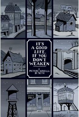 If their still going to tweak the cover, I hope Seth'll make it a little more structured like in this one. Maybe centering the title/author's name, and definitely putting the name of the series (ATWQ) ABOVE the name of the book, or it'll be quite confusing for people. Also, on a sidenote, Seth appears to have drawn the cover for an Aimee Mann album ('Lost in Space'), whom Lemony Snicket has listed in his Playlist of favourite songs. May be how Handler found out about Seth in the first place. Just an interesting tidbit. |
|
|
|
Post by csc on Mar 28, 2012 20:31:05 GMT -5
That cover looks amazing. Why couldn't he do something like that for the book?
|
|
|
|
Post by B. on Mar 29, 2012 1:36:14 GMT -5
The cover is mildly similar to that of adverbs.  |
|
|
|
Post by Dante on Mar 29, 2012 1:58:22 GMT -5
But as Sora also says, 8-12 was the original demographic for ASOUE: it is, unequivocally, a children's series, though with depths that also enable adults to appreciate it (as lots of children's books, from Alice in Wonderland to Harry Potter, have). The fact that even our youngest members are teenagers may lead to our forgetting this sometimes. So I don't think we need see the new series as aimed any younger that ASOUE. That is a point I appreciate, but I do think that the cover, at least, looks less mature than the cover style for ASoUE, regardless of how that reflects on the content. I think it would be hard for anyone to look from an ASoUE cover (HarperCollins or Egmont) to this ATWQ one and say ATWQ looks as carefully and intricately composed. I'm not that worried about the text - chiefly the presentation. The text has the same mind behind it as ever. My fanfic Realtors in the Cave involved the Lavender Lighthouse from TWW in a significant capacity. |
|