|
|
Post by B. on Apr 20, 2012 12:30:06 GMT -5
I recently stumbled upon this collection of covers redesigned for adults by a graphic artist. He has used the photography of Rodney Smith to design the covers, and has done five in total. They are all shown here in a slideshow:  |
|
|
|
Post by Groge on Apr 20, 2012 12:44:29 GMT -5
ha! They are pretty smart!
|
|
|
|
Post by Dante on Apr 20, 2012 13:08:14 GMT -5
I'm not so fond of all of them in their specifics, but I do think the style is completely right, and TWW is fantastic.
|
|
|
|
Post by B. on Apr 20, 2012 14:55:19 GMT -5
I prefer to the cover for The Reptile Room myself.
|
|
|
|
Post by Christmas Chief on Apr 20, 2012 15:17:15 GMT -5
I was about to comment on the sophisticated edge that isn't evident in ASOUE before realizing that was the point. Well, I like the photography, and I think the layout is well planned. Not sure why the center adjective is italicized, though.
|
|
|
|
Post by soufflé on Apr 20, 2012 15:17:17 GMT -5
I agree with Dante; TWW's cover looks excellent.
|
|
|
|
Post by csc on Apr 20, 2012 15:56:29 GMT -5
I really like these. They have a very clean look.
|
|
|
|
Post by JTB on Apr 20, 2012 16:43:36 GMT -5
Looks like a wholly different series. I love them! I wonder what TEE would look like.
|
|
|
|
Post by Kensicle on Apr 20, 2012 19:28:52 GMT -5
I imagine that TEE would show Lemony walking or looking up a long flight of stairs.
I like these covers; they look clean and minimalist. The TWW cover is the best one, I think, but I'm not that fond of the TSS cover.
|
|
|
|
Post by Cafe SalMONAlla on Apr 20, 2012 21:57:11 GMT -5
I don't much care for these. Except for some of the pictures, they layout doesn't look a bit quirky, gothic, or unfortunate. While they're well done for what they are, I just feel that they have totally the wrong mood (unless the books are in disguise).
|
|
|
|
Post by Dante on Apr 21, 2012 3:15:06 GMT -5
I think the mood fits Snicket's author photographs better than they do the actual content of the books themselves, but purely from a design perspective, I think they're quite good.
|
|
|
|
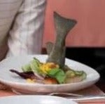
Post by B. on Apr 21, 2012 3:30:11 GMT -5
I wonder what TEE would look like. Maybe it would have this image on the cover?  |
|
|
|
Post by soufflé on Apr 21, 2012 9:33:47 GMT -5
B. I think that image would be fitting, although maybe more so for TPP.
|
|
|
|
Post by csc on Apr 21, 2012 9:37:04 GMT -5
^^I'm not so sure about TPP, because the Denouement hotel was quite isolated.
|
|
|
|
Post by soufflé on Apr 21, 2012 9:39:30 GMT -5
^^I'm not so sure about TPP, because the Denouement hotel was quite isolated. Touché. |
|


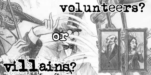
 banner by SherryAnn