|
|
Post by Groge on Jun 28, 2012 13:33:56 GMT -5
|
|
|
|
Post by Dante on Jun 28, 2012 13:51:13 GMT -5
Excellent work, Groge! I'm... going to have to think this one over. Wait oh sweet the spine is octopi, sold!
Edit: Okay. I'm not sure about their choice of colour and the way there's just a block of it, and I'm not sure about that diagonal line still being there, as it's interfering with the series title plate. And there's a weird white zig at the edge of the picture - it's worth noting that, if you compare to the LBC cover, that picture's been extended in all directions. So I definitely think this could do with some nips and tucks. But you know what I'm really happy about? That the U.K. and U.S. will still have different covers, which means we still have twice as much to speculate about when it comes to them! And that spine makes up for a lot, seriously.
|
|
|
|
Post by Old Swinburne on Jun 28, 2012 14:25:41 GMT -5
I think it is funny that, although it is a prequel, the Art Deco art style is chronologically later than the Victorian-esque ASOUE covers.
Well, not that funny.
But it is still better then the US cover, that was trying to get too much on at once. The octopi, as Dante says, makes a big difference.
I don't know why everyone dislikes the diagonal line- it is probably what the man fell from, as he is in the wrong position to have fell from the cliff.
|
|
|
|
Post by Dante on Jun 28, 2012 14:31:57 GMT -5
I agree with your conclusions about the line, somewheresafetosea, but the problem is that it just looks like a line. It doesn't really look like anything.
And Groge, you're right - I checked, and this does play on the U.K. covers, both in their original and subsequent paperback versions. That's really neat! I like that quiet consistency. I wonder if they'll vary not just the colour but also the decoration of the spine in subsequent volumes... if we go by the parallel to the original Egmont ASoUE volumes, they'll change the colour but not the decoration, although that depends on whether octopi are so important to all four books. Hmm.
|
|
|
|
Post by B. on Jun 28, 2012 14:47:21 GMT -5
Oh my God. I wasn't expecting this at all.
I don't really like the lime green colour, and the font, of course, is still there, although the name plate looks better than the original. However Amazon, as I understand, is where anyone can upload their own customer image- which would explain the whit zig thing, as pointed out.
If it is official- the octopi spine definitely does it for me. I hope the spine with the book title along it will be octopi too.
That then brings us down to another question, that affects British residents when they pre-order. Do we get sent the American version or the British version? Obviously the British cover will be in Waterstones or whatever, but I'm planning on pre-ordering mine.
|
|
|
|
Post by Groge on Jun 28, 2012 14:48:37 GMT -5
yeah the line is really odd :/
I agree. I believe following volumes will have the same layout but the colours will change (or at least the spine will) and I reckon the octopi will change too. perhaps that seahorse statue will be on the next? or maybe something completely different that will be announced in the lead up to volume 2. I'm guessing the pattern will remain the same though.
|
|
|
|
Post by Dante on Jun 28, 2012 14:50:44 GMT -5
That then brings us down to another question, that affects British residents when they pre-order. Do we get sent the American version or the British version? Obviously the British cover will be in Waterstones or whatever, but I'm planning on pre-ordering mine. You just have to pre-order the right edition from Amazon; they have separate pages for the editions from the different publishers, so it shouldn't be a problem. And if you were to pre-order it or reserve it in a British store, it'd definitely be the British edition. So I wouldn't worry about that. Personally, I'm planning on getting the British editions, then ordering the American editions in a few years when the inevitable box set of all four comes out. |
|
|
|
Post by Groge on Jun 28, 2012 14:56:36 GMT -5
Oh my God. I wasn't expecting this at all. I don't really like the lime green colour, and the font, of course, is still there, although the name plate looks better than the original. However Amazon, as I understand, is where anyone can upload their own customer image- which would explain the whit zig thing, as pointed out. If it is official- the octopi spine definitely does it for me. I hope the spine with the book title along it will be octopi too. That then brings us down to another question, that affects British residents when they pre-order. Do we get sent the American version or the British version? Obviously the British cover will be in Waterstones or whatever, but I'm planning on pre-ordering mine. Yes, customers can upload pics but I highly doubt this is a fake/temp.cover. Guess we'll just have to wait and see! If you order from Amazon.co.uk you will get the UK version. |
|
|
|
Post by Dante on Jun 28, 2012 15:01:15 GMT -5
With any luck we'll get to see pictures of the actual book at some point, as I'm having difficulty imagining it as an actual solid object; the cover seems so digital, somehow.
|
|
|
|
Post by Poe's Coats Host Toast on Jun 28, 2012 15:05:24 GMT -5
Damn, this is a great cover! Mainly because of the octopi spine. But the composition of all the elements is much better, the car at the bottom is really cool, and I actually like the colors, it gives it more of a retro feel. Of course, the font of "Lemony Snicket" is still lame, but it doesn't look as bad as with the orange background. The black line really doesn't bother me as much as everyone else, but I would've liked the falling figure to be in the center of the circle, otherwise it looks slightly awkward in my eyes. But all in all, I think I may prefer this cover over the American one.
|
|
|
|
Post by csc on Jun 28, 2012 15:26:36 GMT -5
I actually really like this one. It's much better organised, even with the little issues, and like everyone said, the spine looks incredible. I like the car at the bottom, too. It's a nice touch. The color bothers me a bit, but it... fits, I guess.
|
|
|
|
Post by bryan on Jun 28, 2012 16:08:54 GMT -5
I agree with pretty much everyone else- nice spine, weird color. I like how the color scheme is reversed for random octopi on the spine.
|
|
|
|
Post by B. on Jun 28, 2012 16:10:53 GMT -5
Here's the cover without that white blob and the diagonal line has been removed also: 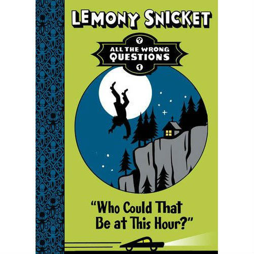 |
|
|
|
Post by Hermes on Jun 28, 2012 17:07:16 GMT -5
Well, honestly I prefer the American cover. Yes, the octopi are nice, but the colour is odd.
I agree with somewheresafetosea about the diagonal line - it must be something significant, not just an annoying intrusion in the picture.
|
|
|
|
Post by Groge on Jun 28, 2012 17:07:21 GMT -5
That does look better Brunch. Did you edit that yourself?  Should add it to Amazon  I'm pretty sure Amazon will have some sort of policy anyway to stop people uploading their "fan" work as it may be. Companies get stock images sent to them from the supplier so hopefully this was one of those, otherwise everyone would be uploading theirs. I'm really pleased with this cover mainly because it's so similar to our ASoUE covers. I hope the spine is similar too, would look great lined up beside the others  As with most of us I don't like the font of "Lemony Snicket" but the colours don't bother me too much. Not a fan of lime green in general but I'm not complaining. |
|


 banner by SherryAnn


 Should add it to Amazon
 As with most of us I don't like the font of "Lemony Snicket" but the colours don't bother me too much. Not a fan of lime green in general but I'm not complaining.