|
|
Post by Dante on Sept 8, 2012 12:49:06 GMT -5
 From Hardie Grant Egmont.  Via Bookworld.com.au. Shame the new Egmont one's so blurry - it appears to have a border, but it's impossible to tell what it is. Probably nothing special, though, looking at it. |
|
|
|
Post by Christmas Chief on Sept 8, 2012 12:53:10 GMT -5
Neat inversion on the first cover, and the second appears to be watermarked in the background with the house from the American cover. (I think the border is still filled with octopi, though; you can see the darkened silhouettes.)
|
|
|
|
Post by Dante on Sept 8, 2012 12:54:43 GMT -5
I meant the border against the spine. On the previous Egmont cover, there's no such border. Compare: 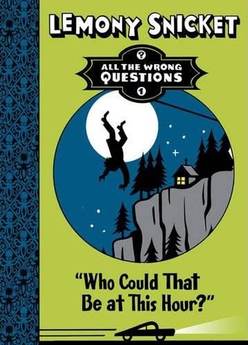 |
|
|
|
Post by Christmas Chief on Sept 8, 2012 13:57:33 GMT -5
Ah, the joint. It appears to be some sort of vine pattern, which isn't that interesting in itself, except for the fact it was changed at all.
|
|
|
|
Post by Poe's Coats Host Toast on Sept 8, 2012 15:26:26 GMT -5
Well that Australian cover's colors look really ugly imo. Dark grey? With that neon green font color and border? I don't know why, but it reminds me of some kiddie board game's packaging... that's badly designed.
|
|
|
|
Post by Cafe SalMONAlla on Sept 9, 2012 2:41:03 GMT -5
Ugh. That Australian cover's really disappointing. The octopus spine print is pretty cool, but it's been completely ruined by the little neon stripe separating it from the grey. Plus, who thought it was good idea to use a dark grey background anyway, particularly considering that there is a large amount of paler grey inside the circle. But worse still is the font in which Lemony Snicket is written. What were the designers thinking? Honestly, people? I don't really like anything about this cover expect the spine pattern.  
|
|
|
|
Post by Dante on Sept 9, 2012 3:35:21 GMT -5
Unfortunately, the "Lemony Snicket" font is taken directly from the U.S. cover and is unlikely to change for the whole series, so we're stuck with it. It's rather ironic, and not in a good way, that the cover design has become so much more cartoony when the written style is actually considerably more mature.
As for the neon green stripe down the spine of the Doubleday cover, I wonder if it's a placeholder for a border, like the one added on the Egmont cover; it appears to be about the same width. So that may not be a permanent feature. I actually quite like the Doubleday; the green on the font reminds me of torchlight in darkness, which was probably the effect they were going for. And as for the Egmont cover, it's pretty interesting that we'd discussed before how it might be improved by a watermark (like their ASoUE had), and now it has one. Also, I'm pretty sure that they've increased the magnification on the octopus spine, which was a wise move; it was a bit too busy on the earlier cover.
Still, though. I think in general we're probably all of the opinion that they made some missteps with the U.S. cover, and that's carried through to the international variants and probably to every subsequent volume as well. It's a good thing the interior's a lot stronger.
|
|
|
|
Post by Poe's Coats Host Toast on Sept 9, 2012 5:00:50 GMT -5
And as for the Egmont cover, it's pretty interesting that we'd discussed before how it might be improved by a watermark (like their ASoUE had), and now it has one. Yes! That's what I thought of when I saw the watermark. May very well be that the publishers are reading the fan response to their updates on the book. I think the border and the watermark are nice improvements over the previous one without the two. The two details seem to tie the cover more together. Still, though. I think in general we're probably all of the opinion that they made some missteps with the U.S. cover, and that's carried through to the international variants and probably to every subsequent volume as well. Yeah, it's a shame Alison Donalty did not design the covers. I bet they'd be great, even if they were totally different from ASoUE. But like you said, most of all I am and think we all should be excited about the content, which seems to be great so far. |
|
|
|
Post by Tryina Denouement on Sept 9, 2012 5:11:21 GMT -5
I think the Doubleday cover is 888 times nicer than the Egmont one.
|
|
|
|
Post by B. on Sept 10, 2012 0:19:06 GMT -5
I actually kinda like the Doubleday cover. The contrast between the green and dark grey doesn't look too bad, and the spine is looking a lot clearer and less cluttered than the Egmont one. There's also more of a dark outline around the centre circular image, which draws you eye into the illustration.
|
|
|
|
Post by The Secretary on Sept 10, 2012 6:02:26 GMT -5
I actually quite like the yellow-green background. Am I alone on this?
|
|
|
|
Post by Dante on Sept 10, 2012 7:07:44 GMT -5
I might when we get a better-quality image. But I genuinely think the Doubleday one is the best, and a lot of people seem not to like that one, so...
|
|
|
|
Post by Kit's tits kick ticks on Sept 10, 2012 8:40:08 GMT -5
I like the Doubleday cover too. At the first sight the yellow/green writing looks almost too bright but the whole cover would look boring without it.
|
|
|
|
Post by Christmas Chief on Sept 10, 2012 14:39:14 GMT -5
I think if they were going for the lantern look the lettering from the Doubleday cover might benefit from having a bit more yellow than green. Other than that, I don't mind the different style, though I prefer the sea green background from Egmont's version.
|
|
|
|
Post by Dante on Sept 12, 2012 7:03:10 GMT -5
Just to make a slight correction: I misinterpreted Doubleday's website. After further research elsewhere, I have learnt that the Australian edition of WCTBATH is actually being published by Hardie Grant Egmont. Gee I wonder why their cover is so similar to Egmont's!
|
|