|
|
Post by Dante on Mar 28, 2012 13:42:59 GMT -5
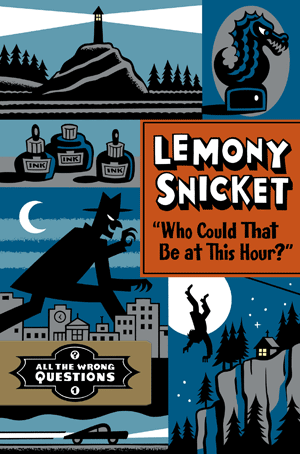 Opinions will naturally be expressed on the full cover now that we have it, and it seems to me that this is a good place to have an ongoing gauging of the mood. Maybe there are parts of it you like and parts you don't, though? It would be a good idea to elaborate on your precise thoughts in a post. Go ahead! Edit: Quite a lot of cover redesigns have also come along in this thread, so let's make it part of this thread's purpose, too. What would the cover look like if you were in charge? |
|
|
|
Post by Groge on Mar 28, 2012 13:55:48 GMT -5
I'd say 2. It's not bad at all but its not perfect. Definitely could be tweaked a bit I think. I would also like a cake though if that's okay.
|
|
Antenora
Detriment Deleter  Fiendish Philologist
Put down that harpoon gun, in the name of these wonderful birds!
Fiendish Philologist
Put down that harpoon gun, in the name of these wonderful birds!
Posts: 15,891 
Likes: 113
|
Post by Antenora on Mar 28, 2012 14:14:13 GMT -5
I choose the uncomfortable fence-- the illustrations are pretty cool, and the background color scheme is well-chosen, but I do have some criticisms: - The whole layout seems jumbled. I actually preferred the teaser cover, where the jumble of images seemed appropriate.
- The colors clash too much, especially that bright orange of the title/author card.
- The font used to write "Lemony Snicket" also seems out of place, too cartoony and gimmicky.
- I like the design of title card, but it's too small and awkwardly placed (centered at the top or bottom would be better). In its current place, it just looks tacked on, and its color also clashes with all the blue.
Overall, then, this cover strikes me as good material poorly arranged. |
|
|
|
Post by Dante on Mar 28, 2012 14:18:52 GMT -5
For me personally, I like Seth's art which I think has that moody, art-deco-y 50s spy style that fits the series, or at least fits what we think it will be about; similarly, I like the style of the ATWQ series title plate, which is silly with a touch of class. But I think they've botched it a bit on a few levels. I think the way the images are arranged seamlessly, with neither a border nor any kind of merging, looks haphazard, as if somebody just stacked them up in MS Paint, with the author and title plates thrown around arbitrarily, and the way they've presented Snicket's name looks too goofy, too cartoony. Also, I have a strictly one-moon limit per cover, and this has two moons in two different phases. None of it has the detail of the ASoUE covers, or the seriousness of presentation; frankly, it looks kind of like they toned it down a little for kids. But it’s important to remember that this is just the front cover of one volume in the series. The spine and back cover might have everything I’m asking for, and future covers may well play with the form in ways that meet with my approbation. Edit: I would also like a cake though if that's okay. Sorry, cakes only for those who haven't seen the cover. You can't have your cover and eat it too. |
|
|
|
Post by Christmas Chief on Mar 28, 2012 14:37:31 GMT -5
I think I'll join the uncomfortable fence brigade, for the cartoon-esque block letters and ATWQ name plate. At first I thought the plate was a truck, and I would have been fine with that, but I agree with others that it looks simply ... stuck there. I don't mind the orange/blue mix - they're exact opposites on the color spectrum - but then I've never had much an eye for coloring. The graphics are arranged in a mostly pleasing manner, I find, with enough going on to intrigue but not too much to clutter. And everyone already knows my feelings about the diagonal line.
|
|
|
|
Post by Dante on Mar 28, 2012 14:44:34 GMT -5
The diagonal line looks as if it's part of something that we can't actually see. When it was on the teaser cover, I assumed it would be shown in "full" on the "real cover," but in fact the teaser cover was, more or less, the real cover... it's an odd detail to leave on if we can't see what it actually is, though. What this makes me wonder is whether all of the cover art images are actually just colourised excerpts of black-and-white interior art? If so... that would both make a lot of sense, but also make a really lazy cover.
|
|
|
|
Post by B. on Mar 28, 2012 14:45:24 GMT -5
This fence hurts.
I like the overall style of Seth's illustrations, but there's a bit too much blue, and orange is too much of a strong colour. Maybe a yellow/gold could've worked instead.
It looks extremely thrown together and the name plate of the series in the bottom left corner looks so out of place, like it's just been slapped in there. And I hate the way that car is just underneath it.
I also agree with Sherry-Ann on the diagonal line. Ugh.
I do like the font used for the title, but it seems odd that "Who could that be at this hour?" is in quotes. The font used for Snicket's name doesn't look too good either, and it looks a little unbalanced having the author's name bigger than the title- unlike the ASoUE covers.
|
|
|
|
Post by Christmas Chief on Mar 28, 2012 14:54:10 GMT -5
I think the fact it's written by Lemony Snicket is a major advertising point, which explains the largeness of the name. For a Snicket book, though, you're right - it's not something we're accustomed to. As for the line, because of the star behind it it appears more a mistake than anything else; if it does end up being part of a bigger picture, they chose a poor place to chop it off. The title is probably in quotes to give it a dynamic feel, i.e., someone is actually asking, "Who could that be at this hour?"
This is certainly one book we should not judge by its cover.
|
|
|
|
Post by Dante on Mar 28, 2012 15:11:40 GMT -5
This article has just pointed out something very interesting about the lighthouse in the top-left of the cover. Have a look at the cover of another Seth-illustrated book:  HMMM.
|
|
|
|
Post by Christmas Chief on Mar 28, 2012 15:17:13 GMT -5
Based on the book's premise, the lighthouse would appear metaphorical. So too might TFQ's lighthouse?
|
|
Antenora
Detriment Deleter
Fiendish Philologist
Put down that harpoon gun, in the name of these wonderful birds!
Posts: 15,891
Likes: 113
|
Post by Antenora on Mar 28, 2012 15:17:18 GMT -5
You're right, it's nearly identical except for the color scheme and structure of the rock (which on WCTBATH, looks like a spiral climbing path).
And while the giant on WCTBATH is most likely metaphorical, I'd expect the other elements to have a literal presence.
|
|
|
|
Post by Christmas Chief on Mar 28, 2012 15:18:38 GMT -5
Is this how Seth always draws lighthouses, or is there a link between the two?
Yes, I suspect the lighthouse is literal, but would not be surprised should it have a second meaning.
|
|
|
|
Post by Dante on Mar 28, 2012 15:30:13 GMT -5
The lighthouses are too similar for it to be a coincidence, so I'm going to go with Seth paying homage to an earlier work. Maybe one Handler really enjoyed, for all we know.
|
|
|
|
Post by B. on Mar 28, 2012 15:55:56 GMT -5
I want Brett back.
|
|
|
|
Post by Christmas Chief on Mar 28, 2012 16:01:18 GMT -5
Interesting; the poll makes a bell graph shape now.
The idea of the lighthouse being Seth's private (or public) allusion is a good one. I wonder if he chose the Finding cover image, or if it was requested.
|
|


 banner by SherryAnn


