Post by Dante on Aug 2, 2014 12:19:21 GMT -5
Before I get onto my own new redesign idea, did you know that LB themselves had done slight redesigns of the cover format for their paperback editions of the series?
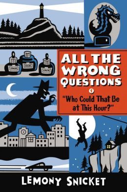
Notice how simply shifting the series title into the title box and giving it a new font has made the cover look so much classier. They even put the "Be" in ?1's title on the top row, as I suggested! Because that is how you would actually speak the title. Notice also, though, that their insistence on using the same bubble text for the author name has rather ruined the border it's placed on at the bottom, with the name awkwardly centered amid a sea of black. If they'd chosen a plainer capitalised font and spaced it out across that black band, it would've looked fine. Oh well. Incidentally, did you know that ATWQ's cover designer no longer works at Little, Brown & Co.? I just thought I'd mention that.
Anyway, before we get onto my sketch, please bear in mind that, as established in the thread, I have only MS Paint, inadequate drawing ability, and an awkward mouse to work with. Thank you.
I went right back to the drawing board and started thinking about cover design basics, looking up noir covers, stuff like that. Eventually I decided that the most important fact about the series is that it is part of a series, so I wanted the series title in big up at the top, with Snicket's name visible above it but not quite so conspicuous or eye-grabbing. From there I wanted the actual title way down at the bottom. I'd thought about torchlight illuminating the series or author name but then I came up with a flipped version, which was lamplight from above shining down and revealing the title. I'd also had an idea for the question mark of the title to be immensely tall and reaching up the side of the book, so I combined the two ideas and made the question mark into a lamppost which shines its light down from the top. From there I built it up to the version below. (I think in the present version you can't quite make the question mark out well enough for a variety of reasons, and the lamp could also reach in front of the title plate as well, but hey, it's just a playful draft.)
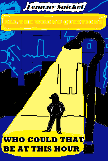
The rest of the geography suggested itself fairly plainly - a silhouette standing in the light, that being Lemony in the first book, then Ellington, then let's say Qwerty, then Hangfire; I'd been picturing a possible cover layout involving Lemony walking down moody and tall dark streets, so I added in the black city backdrop to impose over him and emphasise a noir atmosphere while also contrasting with the coloured ground and sky. Those are, obviously, in the key colour of each book - the ground and sky in ?2 would be purple, orange for ?3, green for ?4.
And the sky? I wanted to reserve the panelled element from the original covers in some form, and at first I was thinking photos fluttering down in the lamplight, but then I realised having them be the sky, looming over the city and looking down on it and always hovering in the background, was a perfect metaphor as well as working visually. The series plate is meant to be a shiny metal plate but it gets rusty and tarnished and cracked as the series goes on; Lemony's name is printed on a scrap of newspaper blowing in the breeze. I think that, if drawn and composed by somebody with actual professionalism and talent in the industry, this cover design would've been quite a good one for the series.
Notice how simply shifting the series title into the title box and giving it a new font has made the cover look so much classier. They even put the "Be" in ?1's title on the top row, as I suggested! Because that is how you would actually speak the title. Notice also, though, that their insistence on using the same bubble text for the author name has rather ruined the border it's placed on at the bottom, with the name awkwardly centered amid a sea of black. If they'd chosen a plainer capitalised font and spaced it out across that black band, it would've looked fine. Oh well. Incidentally, did you know that ATWQ's cover designer no longer works at Little, Brown & Co.? I just thought I'd mention that.
Anyway, before we get onto my sketch, please bear in mind that, as established in the thread, I have only MS Paint, inadequate drawing ability, and an awkward mouse to work with. Thank you.
I went right back to the drawing board and started thinking about cover design basics, looking up noir covers, stuff like that. Eventually I decided that the most important fact about the series is that it is part of a series, so I wanted the series title in big up at the top, with Snicket's name visible above it but not quite so conspicuous or eye-grabbing. From there I wanted the actual title way down at the bottom. I'd thought about torchlight illuminating the series or author name but then I came up with a flipped version, which was lamplight from above shining down and revealing the title. I'd also had an idea for the question mark of the title to be immensely tall and reaching up the side of the book, so I combined the two ideas and made the question mark into a lamppost which shines its light down from the top. From there I built it up to the version below. (I think in the present version you can't quite make the question mark out well enough for a variety of reasons, and the lamp could also reach in front of the title plate as well, but hey, it's just a playful draft.)
The rest of the geography suggested itself fairly plainly - a silhouette standing in the light, that being Lemony in the first book, then Ellington, then let's say Qwerty, then Hangfire; I'd been picturing a possible cover layout involving Lemony walking down moody and tall dark streets, so I added in the black city backdrop to impose over him and emphasise a noir atmosphere while also contrasting with the coloured ground and sky. Those are, obviously, in the key colour of each book - the ground and sky in ?2 would be purple, orange for ?3, green for ?4.
And the sky? I wanted to reserve the panelled element from the original covers in some form, and at first I was thinking photos fluttering down in the lamplight, but then I realised having them be the sky, looming over the city and looking down on it and always hovering in the background, was a perfect metaphor as well as working visually. The series plate is meant to be a shiny metal plate but it gets rusty and tarnished and cracked as the series goes on; Lemony's name is printed on a scrap of newspaper blowing in the breeze. I think that, if drawn and composed by somebody with actual professionalism and talent in the industry, this cover design would've been quite a good one for the series.