|
|
Post by Dante on Jun 13, 2012 5:03:41 GMT -5
That's definitely an interesting take on it. If they were to format it a bit more like a book cover rather than a promotional poster, then maybe... that said, all of my concerns about Seth's art have now been allayed; it's just a matter of how it's used.
|
|
|
|
Post by Christmas Chief on Jun 13, 2012 5:12:22 GMT -5
Nice work, particularly if it were a poster. I printed out some bookmarks the other day to hand out to people in the same spirit. |
|
|
|
Post by Kensicle on Jun 13, 2012 5:14:26 GMT -5
It's a promotional poster from the 9 June edition of the Sydney Daily Telegraph, part of an " article" on it which turned out to be the first chapter. Sherry Ann, I like those bookmarks. Did you make them, or are they official? |
|
|
|
Post by Christmas Chief on Jun 13, 2012 5:22:11 GMT -5
Not official, I made them. It would probably be nice to include more information on the back, so perhaps I'll work on that later.
|
|
|
|
Post by B. on Jun 13, 2012 10:18:52 GMT -5
For one thing the cover certainly looks a lot less aimed at Children and more at adults. I notice the artist has still stuck to the blue theme of the novel. It's certainly great inspiration for the upcoming contest!
@sherry Ann: That book mark looks quite classy and I like how you've used a graph paper background.
|
|
|
|
Post by Christmas Chief on Jun 13, 2012 10:42:31 GMT -5
Thank you. The graph paper was actually an effort to be printer-friendly, but as of a few minutes ago it looks like graph paper illustrations will be used in the actual book itself.
|
|
|
|
Post by Dante on Jun 15, 2012 2:06:57 GMT -5
We've seen a lot more of Seth's interior artwork now, and it seems to be a lot more detailed, and in some elements less cartoony, than the cover. My question is: Why the big difference? I actually think the cover is almost misleading, now.
|
|
|
|
Post by Cafe SalMONAlla on Jun 15, 2012 2:38:55 GMT -5
You are quite right, Dante. There is a huge difference between the cover at and the inside art. Maybe the cover art was supposed to be more "striking" or something. I quite like the inside art (same as the promo emails use) and I'm quite relived that it doesn't follow the cover style – which disappointed me greatly.
|
|
|
|
Post by Kensicle on Jun 15, 2012 3:27:37 GMT -5
The publishers probably thought that the 8-12 age range is attracted to striking graphics, or something.
There's a lot of kids who enjoy reading books about clandestine spies, so they're probably trying to project that image.
I think that wouldn't have hurt to go for the scrapbook style, like TUA. That woud've been appealing to most age ranges, I think.
|
|
|
|
Post by B. on Jun 15, 2012 12:13:27 GMT -5
 What do you think? |
|
|
|
Post by Dante on Jun 15, 2012 12:25:01 GMT -5
It's an interesting combination, very striking, but I'm not sure the photorealism really works for Snicket - not unless it's something deliberately vintage-looking. It's too sophisticated.
|
|
|
|
Post by B. on Jun 15, 2012 12:40:51 GMT -5
More blue needed for the blue scheme? 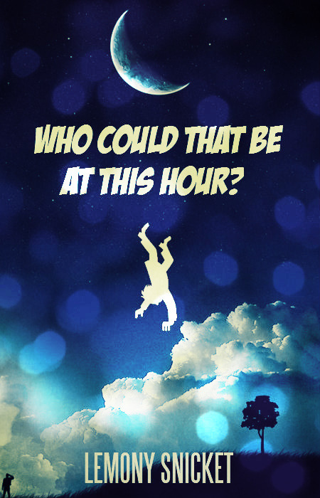 |
|
|
|
Post by Christmas Chief on Jun 15, 2012 15:01:16 GMT -5
Interesting blend, but it rather takes the focus away from Seth's style, doesn't it? That is, the simplistic graphic pales next to the comparatively detailed and layered photography. If it were an adult cover, maybe, as the color scheme is well planned and overall effect is very symmetrical.
|
|
|
|
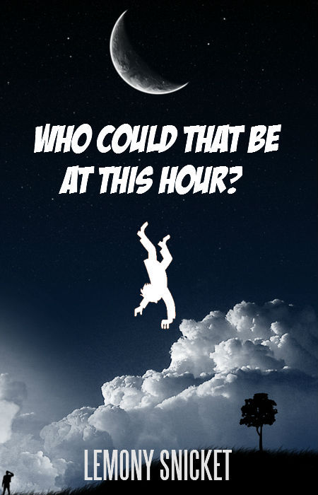
Post by B. on Jun 15, 2012 15:20:44 GMT -5
Yes, I agree it would be more suited to one of those "adult covers" like the ones for the Harry Potter books. The original is above, but then I made this one blue, in keeping with the colour scheme. 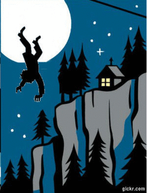 I made this gif the other day. I shouldn't attempt to make gifs again. |
|
|
|
Post by A on Jun 15, 2012 19:00:27 GMT -5
The falling man in the first one is a bit out of place in the first cover, but I would like it if it wasn't a LS book. The second cover is covered with dots too many for my liking, but they have to be there to allow the falling dude to blend in and look natural, that is - the background in A is to un-cartoonish compared to falling Man, but in B, the colour is more artificial so falling man looks more in place.
|
|